Color deviation is one of the most expensive problems in wall art sourcing — and it almost always starts before production begins. A buyer approves a sample under warm showroom lighting, the factory runs 2,000 units on a different substrate batch, and the containers arrive with greens that read yellow and sky blues that look grey. The return rate climbs. The retail buyer pushes back. You eat the freight both ways.
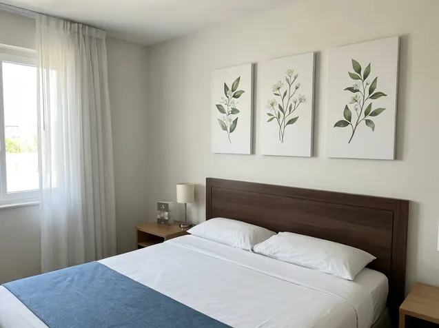
We've been running Nature Wall Arts production at Livewellcraft since 2008, and color accuracy on nature imagery is genuinely harder than abstract or geometric work. Forest greens, earth tones, and sky gradients are colors the human eye calibrates against real-world references. A buyer notices a shifted green in a botanical print immediately — the same buyer might not notice a shifted teal in an abstract piece for weeks. That asymmetry means your color spec discipline on nature wall art needs to be tighter than on other categories.
This guide walks through the full workflow: source file preparation, substrate-matched proofing, Delta E tolerances worth specifying, sample sign-off protocol, and the batch QC gates that keep mass production honest.

Why Color Shifts Between Sample and Mass Production
The sample you approved was printed on one substrate sheet, on one day, with one ink batch. Mass production is none of those things.
Three mechanisms drive most of the deviation we see:
Substrate absorption variation. Canvas, MDF, metal sheet, and wood panel each absorb ink differently — and within a single substrate type, absorption varies by batch, humidity at time of printing, and surface coating consistency. A canvas with slightly higher sizing content will hold ink on the surface longer, producing more saturated color. The next canvas batch with lower sizing absorbs faster, and your forest greens go flat.
Ink batch drift. Pigment concentration in inkjet and UV-curable inks varies between manufacturing lots. Most ink suppliers hold color within a tolerance, but that tolerance is wide enough to shift nature imagery noticeably — particularly in the yellow-green range where botanical colors live. We track ink lot numbers against our color reference prints for exactly this reason. (We've seen a single ink lot change shift a moss green by Delta E 4.2 — enough to fail a retail color standard.)
Ambient conditions during printing. Temperature and relative humidity affect ink viscosity, dot gain, and drying speed. A proof printed in a climate-controlled sample room and a production run on the floor in August are not the same print environment. Factories that don't control ambient conditions during production runs will see batch-to-batch drift even with identical files and ink.
Understanding these three mechanisms tells you where to put your controls — and what to ask your factory to document.
Source File Preparation: What to Lock Before You Send Anything
Color accuracy starts with the file, not the proof. If you send a poorly prepared source file, no amount of factory-side profiling recovers it cleanly.
Color space: Submit artwork in Adobe RGB (1998) or ProPhoto RGB for wide-gamut printing. sRGB clips the color range on nature imagery — particularly in saturated greens and deep blues — and you'll never get those colors back in print. If your designer works in sRGB, ask them to convert to Adobe RGB before export and check that the conversion didn't flatten any gradients.
Resolution: 150 PPI at final print size is the practical minimum for wall art viewed at normal room distance. For pieces under 60 cm on the short side, 200 PPI is safer. Upscaled low-resolution files produce banding in sky gradients and loss of fine detail in foliage — both are immediately visible in nature imagery.
Embedded profile: The file must have an embedded ICC profile. A file without an embedded profile will be interpreted differently by every RIP system the factory uses. This is one of the most common causes of "the proof looked right but the production run didn't" complaints.
Pantone callouts for critical colors: For nature wall art with specific brand or collection colors — a signature green in a botanical series, a particular earth tone in a landscape collection — include Pantone references for those colors in your purchase order. This gives the factory a physical reference point that survives file transfer and monitor calibration differences.
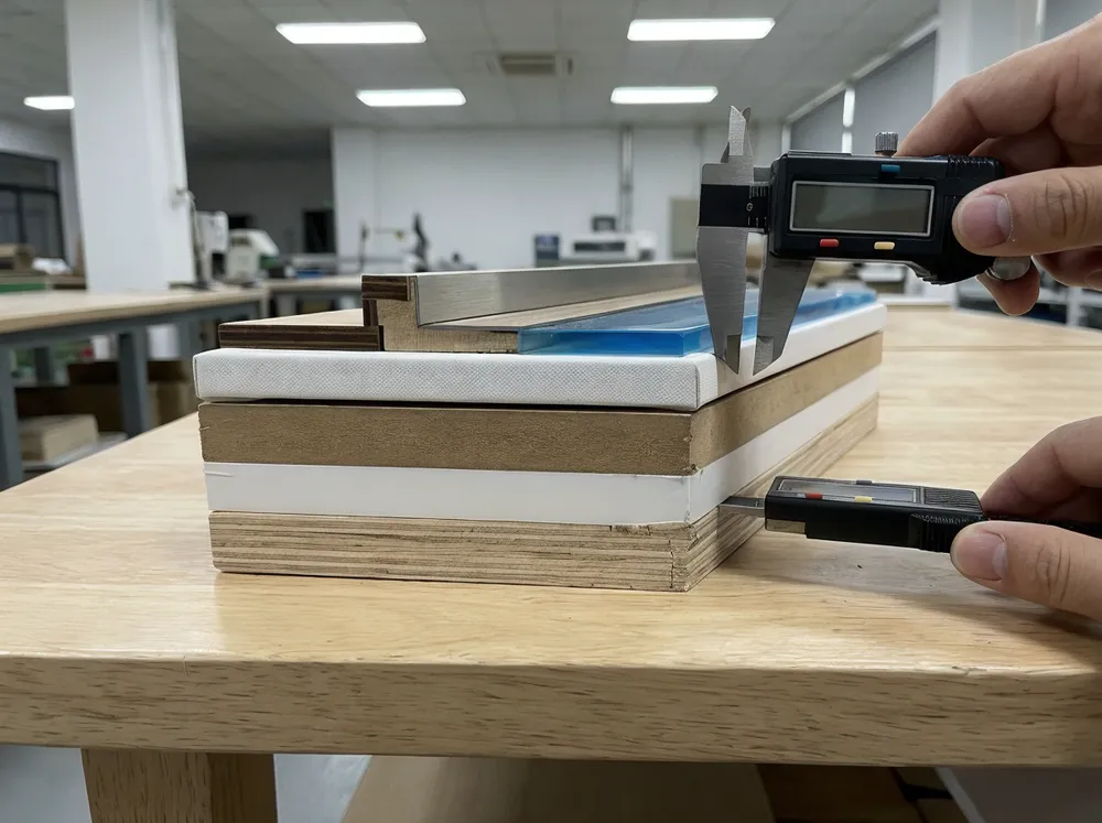
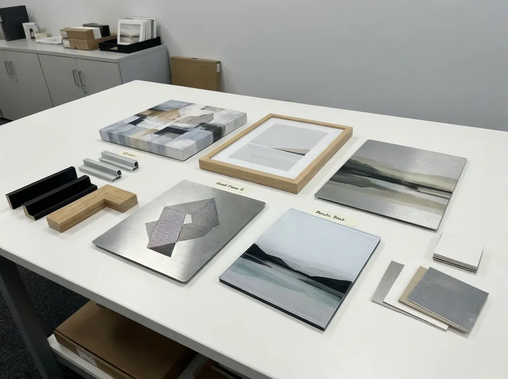
Substrate-Matched Proofing: The Step Most Buyers Skip
A proof printed on the wrong substrate is not a proof. It's a guess.
We run proofs on the exact substrate specified for the production order — same canvas weight and sizing, same metal sheet coating, same wood panel sealer. The color behavior is different enough between substrate types that approving a canvas proof for a metal print order will produce a visibly different result in production.

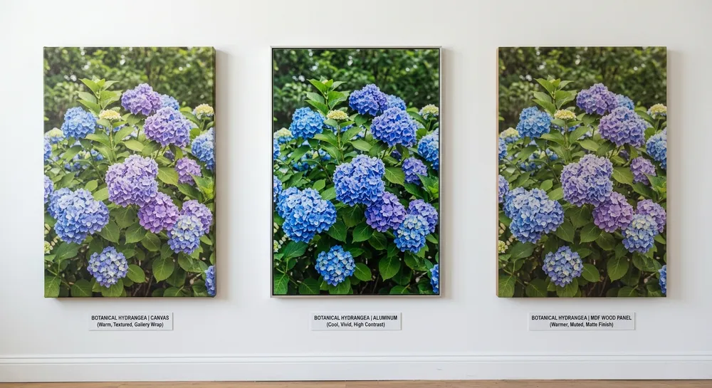
Here's how the three most common nature wall art material options behave differently:
Canvas: Warm base tone. Ink absorbs into the weave, which softens fine detail and slightly desaturates colors. Forest greens read slightly warmer and less vivid than on screen. Sky blues shift toward grey-blue. Earth tones are generally the most stable on canvas — they tend to look natural and rich.
Metal (aluminum sheet): Cool, high-contrast base. UV-curable inks sit on the surface coating rather than absorbing, producing more saturated, punchy color. Greens can read more vivid than intended. Sky blues stay true or shift slightly cooler. The risk on metal is over-saturation — nature imagery can look hyper-real rather than natural if the file isn't adjusted for the substrate.
Wood panel (MDF with sealer): Warm, slightly muted. The sealer coat controls absorption but the wood grain texture and warm undertone affect color perception. Earth tones and warm landscape colors work well. Cool blues and greens can shift warmer than intended. This substrate rewards nature imagery with warm palettes — forest floors, autumn foliage, desert landscapes.
When you request a proof, specify the substrate by name and grade. "Canvas proof" is not specific enough. "380gsm poly-cotton canvas with standard gesso sizing" is.
Delta E Tolerances for Wholesale Wall Art
Delta E (ΔE) is the numerical measure of color difference between two samples. A Delta E of 1.0 is the threshold of perceptibility for a trained observer under controlled lighting. A Delta E of 3.0 is visible to most people. A Delta E above 5.0 is a clear mismatch that will generate returns.
For wholesale wall art, these are the working tolerances we use and recommend specifying in your purchase order:
| Substrate | Acceptable ΔE (per color) | Maximum ΔE (any single color) | Notes |
|---|---|---|---|
| Canvas | ≤ 3.0 | ≤ 5.0 | Earth tones typically hold tighter; sky blues are the drift risk |
| Metal sheet | ≤ 2.5 | ≤ 4.0 | Higher contrast amplifies deviation — tighter tolerance needed |
| Wood panel | ≤ 3.5 | ≤ 5.5 | Warm substrate shift is expected; spec the warm-adjusted proof |
| Acrylic face-mount | ≤ 2.0 | ≤ 3.5 | Premium product — buyers expect near-perfect color fidelity |
These are measured under D50 or D65 standard illuminant using a spectrophotometer. If your factory is measuring color under retail store lighting or a phone camera, those numbers mean nothing.
For nature imagery specifically, pay attention to the yellow-green range (roughly Pantone 375–390 C) and the sky blue range (Pantone 279–292 C). These are the colors where human perception is most sensitive and where substrate-driven drift is most common.

Sample Sign-Off Protocol: What to Specify and What to Document
The sample approval step is where most color problems get locked in — or locked out. A loose sign-off process means you're approving a feeling, not a specification.
Lighting standard. Evaluate samples under D50 (5000K) or D65 (6500K) standard illuminant. D65 is the standard for graphic arts and print; D50 is common in color-critical manufacturing. Either is acceptable — what matters is that both you and the factory use the same standard. If you're evaluating under warm incandescent or cool LED office lighting, you will approve colors that fail under retail store lighting.
Physical reference swatch. Keep a physical signed swatch from the approved sample. This is your production reference. If a dispute arises at shipment, the swatch is the arbiter — not a monitor, not a photo, not a memory.
Substrate sample documentation. Record the substrate batch used for the approved proof: supplier, grade, lot number if available. When production runs on a different substrate batch, the factory should run a color check against the reference swatch before committing to the full run.
Sign-off document. The sign-off should record: approval date, substrate spec, ink type, Delta E readings for 3–5 critical colors, lighting standard used, and the name of the person approving. This document travels with the order.
Here's a practical sample-approval checklist you can send to your factory with the order:
—
Sample Approval Checklist — Nature Wall Art Color Accuracy
- [ ] Source file submitted in Adobe RGB or ProPhoto RGB with embedded ICC profile
- [ ] Resolution confirmed at ≥ 150 PPI at final print size
- [ ] Pantone references provided for critical colors (greens, sky blues, earth tones)
- [ ] Proof printed on production-matched substrate (same grade and lot where possible)
- [ ] Proof evaluated under D50 or D65 standard illuminant
- [ ] Delta E measured for minimum 3 critical colors using spectrophotometer
- [ ] Delta E readings within specified tolerance (per substrate table above)
- [ ] Physical signed swatch retained by buyer and factory
- [ ] Substrate batch documented (supplier, grade, lot number)
- [ ] Sign-off document completed with date, approver name, and Delta E readings
—
(We send this checklist to every new buyer before their first production run. It takes 20 minutes to complete and prevents the kind of dispute that takes three weeks to resolve.)
Common Procurement Mistakes That Create Color Problems
These are the patterns we see repeatedly — not from careless buyers, but from buyers who didn't know what to ask for.
Approving samples under retail or office lighting. The most common mistake. Warm retail lighting makes colors look richer and more saturated than they are. You approve a botanical print that looks lush under the showroom light. Under D65 in the warehouse, the greens look flat. Specify the lighting standard in writing before you evaluate anything.
Skipping substrate-matched proofs to save time. A factory offers a "quick digital proof" — a monitor preview or a print on whatever substrate is loaded. You approve it to move faster. Production runs on the actual substrate and the colors shift. The time saved on the proof costs you weeks on the return.
Not specifying ink type. Aqueous dye, aqueous pigment, UV-curable, and latex inks all produce different color gamuts and different longevity profiles. Dye inks produce vivid color but fade faster under UV exposure — a problem for wall art near windows. Pigment inks are more fade-resistant but have a narrower gamut on some substrates. If you don't specify, the factory uses whatever is loaded. Specify ink type in your purchase order.
Approving color on a single unit, not a batch sample. A single proof can be cherry-picked. Ask for three units from the same print run — if the color is consistent across all three, the process is under control. If unit 1 and unit 3 look different, the factory has a consistency problem you need to address before committing to volume.
No Delta E requirement in the purchase order. Without a numerical tolerance in the PO, "color accuracy" is a subjective conversation at inspection. Put the numbers in the document.
How Vertical Integration Keeps Batch-to-Batch Color Consistent
This is where factory structure matters to your sourcing decision.
When a trading company sources your wall art, the print shop, the substrate supplier, and the finishing operation may all be separate vendors. The trading company coordinates them but doesn't control them. When the substrate supplier changes a coating formula or the print shop swaps ink suppliers, nobody tells the trading company until the containers are loaded.
We run printing and coating in-house at our 12,000 m² facility in Dong Nai. Our 12-person engineering team manages color profiling for each substrate we run — we maintain ICC profiles for every substrate grade we stock, and we update those profiles when substrate batches change. When a new canvas lot arrives, we run a test print against our reference before it goes into production. That's not a policy we wrote for a certification audit — it's how we avoid reprints.
The practical difference for your order: when you approve a color spec with us, that spec is enforced by the same team that runs the press, not communicated through a middleman to a subcontractor. If something drifts during a production run, our QC team catches it on the floor, not at final inspection.
(We've had buyers come to us after a trading-company order where the first 500 units matched the sample and the last 1,500 didn't. The trading company had no visibility into the mid-run substrate change. We now document substrate lot numbers on every production order as standard practice.)
For buyers sourcing through Wall Arts by Style & Subject, this vertical integration is the practical reason color consistency holds across large orders.
Batch QC Gates During Mass Production
Sample approval is the entry gate. Batch QC gates are what keep the production run honest.
A single approved sample does not guarantee 2,000 consistent units. Color drift can happen mid-run from ink depletion, substrate variation, or environmental changes. Without QC gates, you find out at final inspection — or worse, at the customer's warehouse.
The QC structure we run on nature wall art production orders:
First-off check. The first unit off the production run is measured against the approved reference swatch. Delta E is recorded for the same critical colors measured at sign-off. If any color exceeds tolerance, the run stops before it starts.
Mid-run sample. At 25–30% through the run, we pull three units and measure. This catches ink depletion drift and substrate batch transitions. (Ink cartridges or bulk ink systems don't deplete linearly — color can shift as ink levels drop, particularly in the cyan and yellow channels that drive greens and sky blues.)
Final batch sample. Three units from the last 5% of the run are measured and compared to the first-off. If the spread between first-off and final batch exceeds 1.5 ΔE on any critical color, we flag it before shipment.
Documentation. Delta E readings from all three checkpoints travel with the shipment documentation. If your receiving team or retail buyer has a color question, the data is already there.
This three-gate structure adds time to the production process. It also means you don't receive 2,000 units where the first pallet matches the sample and the second pallet doesn't.

What to Include in Your RFQ to Get Accurate Color Specs Back
A vague RFQ produces a vague quote. If you want the factory to quote color accuracy correctly the first time, give them the information they need to do it.
Include in your RFQ:
- Artwork files in Adobe RGB or ProPhoto RGB with embedded ICC profiles
- Target substrate by name and grade (not just "canvas" — specify weight, coating type)
- Critical color callouts — Pantone references for the 3–5 colors that matter most in the design
- Delta E tolerance — specify acceptable and maximum ΔE per the table above, or ask the factory to confirm what they can hold
- Ink type preference — pigment vs. dye vs. UV-curable, and any fade-resistance requirements
- Quantity and order frequency — batch size affects which QC structure is practical
- Lighting standard for evaluation — D50 or D65, and whether you need the factory to provide spectrophotometer data with shipment
When we receive an RFQ with this information, we can return a color-matched proof with Delta E data and a production price within 48 hours. When we receive "please quote 500 pcs botanical canvas print," the back-and-forth to clarify specs takes longer than the proof itself.
If you're ready to lock in color accuracy on your next nature wall art order, Request Quote with your artwork files and substrate spec — our engineering team will handle the color profiling from there.
FAQ
What Delta E tolerance should I specify for nature wall art in a retail program?
For standard retail programs, specify ΔE ≤ 3.0 acceptable and ΔE ≤ 5.0 maximum per color, measured under D65. For premium or branded collections where color is a selling point, tighten to ΔE ≤ 2.0 acceptable. Put these numbers in the purchase order, not in an email — they need to be part of the contractual spec.
Can I approve a digital proof on screen instead of a physical substrate proof?
No. Monitor calibration, ambient lighting, and screen gamut all affect what you see. A calibrated monitor in a controlled environment can be useful for checking composition and gross color direction, but it cannot substitute for a physical proof on the production substrate. Always require a physical proof before approving a production run.
What's the difference between dye and pigment inks for nature wall art?
Dye inks produce wider color gamut and more vivid color, but fade faster under UV exposure — typically 2–3 years before visible fading near windows without UV-protective coating. Pigment inks are more fade-resistant (25+ years under glass, 5–10 years unprotected) but have a slightly narrower gamut on some substrates. For retail wall art that will hang near windows or in high-light environments, specify pigment inks or UV-curable inks with UV-protective topcoat.
How do I handle color approval when I'm sourcing remotely and can't visit the factory?
Request that the factory ship two physical proofs — one for your evaluation, one retained at the factory as the production reference. Evaluate your proof under D50 or D65 and return written sign-off with your Delta E readings. Ask the factory to confirm their readings match yours before production starts. This process works reliably when both sides are measuring under the same lighting standard.