What a Mismatched Wall Art Shipment Actually Costs You
I've watched this play out too many times: a buyer orders 3,000 pieces across three wall art styles, and when the container arrives, the gold on the modern frames reads warm, the gold on the abstract frames reads cool, and the nature pieces have a slightly different sheen. Same PO, same "gold" callout, three visibly different results.
If you're selling through retail or e-commerce, your customer sees those pieces side by side on a shelf or in a product grid. Inconsistent finish reads as cheap. Returns climb. Reorders don't come. And you're stuck negotiating a partial credit with a factory that technically met the spec you wrote, because "gold" was all you specified.
The fix isn't finding a better factory. It's controlling the variables that cause finish drift before production starts, and choosing a sourcing structure that keeps those variables from multiplying.
Why Color and Finish Drift Happens Across Style Categories
The root cause is almost always one of two things: vague finish specifications in the RFQ, or multiple suppliers handling different style categories.
When you write "gold finish" on a purchase order without a reference standard, you're leaving the interpretation to whoever mixes the paint that morning. Gold can mean anything from RAL 1036 pearl gold to a warm brass tone to a champagne metallic. Each substrate absorbs and reflects coating differently, so even the same paint formula looks different on an MDF frame versus a metal one versus resin.
Multi-vendor sourcing compounds the problem. If your modern frames come from one factory and your nature frames come from another, each facility runs its own coating equipment, spray booth humidity, curing temperature, and paint supplier. The chance of two separate factories producing a visually identical gold across different substrates is close to zero.
This is the core issue with sourcing wall arts by style from fragmented suppliers. Every additional vendor you add is another set of uncontrolled variables between your approved sample and your delivered product.

How to Write a Wall Art RFQ That Locks In Color, Finish, and Substrate
Most finish problems get solved or created at the specification stage. Here's how to write specs that leave no room for interpretation.
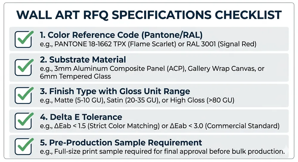
1. Specify color with a reference standard, not a name. Use Pantone, RAL, or NCS codes. "Matte black" is not a specification. "RAL 9005 jet black, matte finish, 10-15 gloss units measured at 60°" is. If you're matching an existing product line, send a physical sample. Digital color references shift between screens and printers.
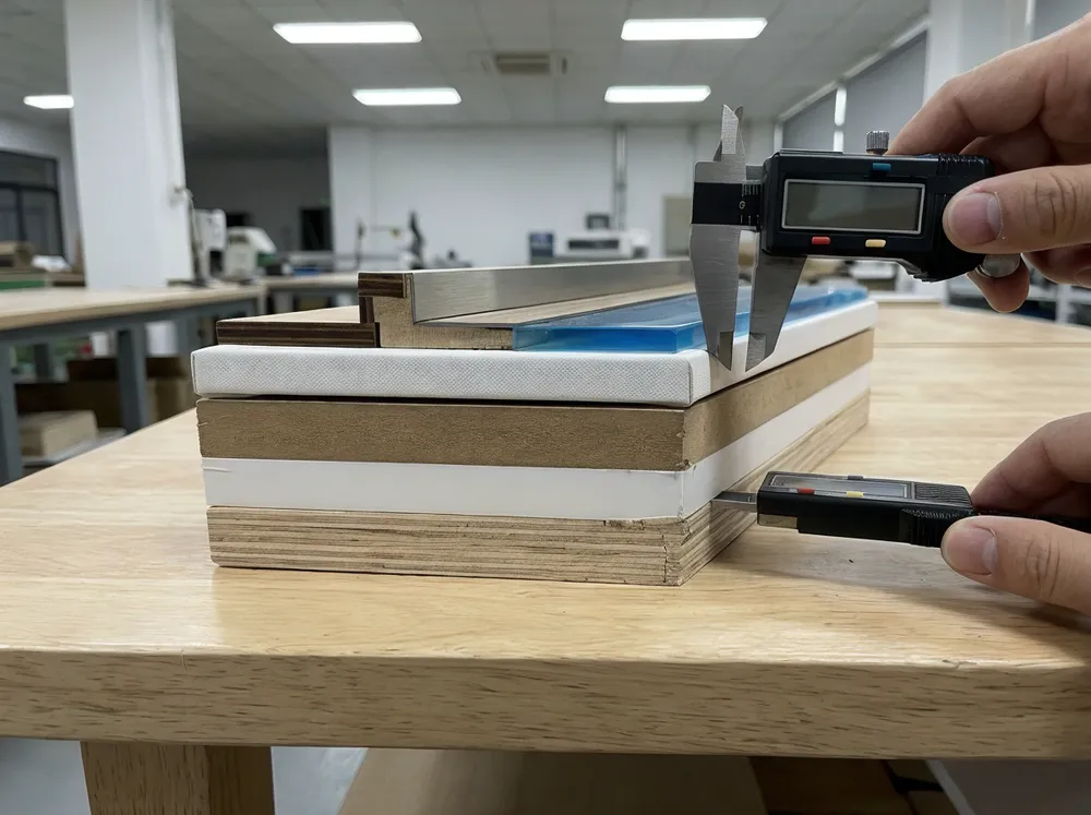
2. Call out the substrate for each style. Your modern geometric pieces might use metal frames. Your nature pieces might use MDF with a wood-grain texture. State the substrate explicitly in each line item, because the coating process and primer system change with the material. A primer that works on metal won't bond the same way to MDF.
3. Define finish type and gloss level separately. "Matte" means different things to different factories. Specify the gloss unit range you'll accept, measured at 60° angle:
| Finish Type | Gloss Units (60°) |
|---|---|
| Dead matte | 0-5 GU |
| Matte | 5-20 GU |
| Satin | 20-40 GU |
| Semi-gloss | 40-70 GU |
| High gloss | 70-100 GU |
Put the number in the RFQ. "Matte, 10-15 GU at 60°" removes ambiguity.
4. Include a tolerance band for color deviation. Delta E (ΔE) is the standard measurement for color difference between two samples. For wall art, a ΔE of 1.5 or less between approved sample and production is a reasonable target. Anything above 3.0 is visible to the naked eye and will cause problems on a retail shelf. Write this into your QC agreement.
5. Request a pre-production sample for each style-substrate-finish combination. Not one sample for the whole order. One per combination. If you have three styles with different substrates, that's three samples minimum. Approve each one individually before the line starts.

Material and Finish Pairing by Style Category
Different wall art styles pair naturally with specific materials and finishes. Getting this pairing right at the specification stage prevents rework and returns.
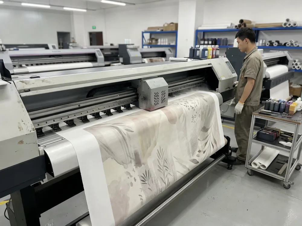
Modern wall arts rely on clean lines and geometric precision. Metal and high-density MDF frames work best here. Finishes are typically solid and uniform: matte black, brushed gold, satin white. The coating needs to be defect-free because geometric designs expose every imperfection. We spray these with electrostatic application in a controlled booth to keep coverage even on sharp edges and flat planes. If you're building a modern wall arts program, specify solid-color finishes with tight gloss tolerances.
Abstract wall arts often feature unpredictable color palettes in the artwork itself, so the frame finish needs to complement without competing. Neutral frames work best: raw wood tone, matte charcoal, antique bronze. Resin and MDF are common substrates because abstract wall arts often use irregular or sculptural frame profiles that metal can't achieve cost-effectively. Antique and patina finishes require multi-step application, so make sure your factory can run those steps in sequence without outsourcing the topcoat.
Nature wall arts lean toward organic finishes: wood grain, distressed textures, matte earth tones. These are the hardest finishes to keep consistent across a large run because distressing and texture effects involve manual steps. If you're ordering 2,000 nature wall arts with a distressed white oak frame, make sure the factory maintains a physical reference panel that operators check against throughout the run. Without that reference, "distressed" drifts from piece 100 to piece 2,000.
(We keep a physical reference library of over 200 finish samples at our facility. When a repeat order comes in, we pull the original approved sample and re-match before production starts. It sounds basic, but a surprising number of factories rely on phone photos for color matching between orders.)
How to Verify Finish Consistency Before Shipment
Approving a pre-production sample is step one. Verifying that the bulk run matches the sample is step two, and it's where a lot of buyers lose control.
- Request in-line inspection photos at 25% and 75% of the production run. Color drift often happens gradually as coating materials are replenished or spray equipment wears. Catching it mid-run is cheaper than catching it at the port.
- Ask for gloss meter readings on a per-batch basis. A gloss meter costs under $200 and gives you an objective number instead of a subjective opinion. If the factory won't provide readings, that tells you something about their QC setup.
- Compare pieces from the beginning and end of the run side by side under the same lighting. Fluorescent warehouse lighting hides color differences that daylight reveals. Specify D65 or daylight-equivalent lighting for color sign-off in your QC protocol.
- Check edges and recessed areas. These are where coating coverage drops first. On MDF frames, edges absorb more primer and can read darker than flat surfaces. On metal frames, inside corners may have thinner coverage from the spray gun angle.
(I've had buyers approve samples under warm showroom lighting, then reject the bulk shipment when they unpacked it under cool LED warehouse lights. Same color, different perception. Always specify the lighting condition for color approval upfront.)
How Single-Factory Production Eliminates Cross-Style Finish Drift
When all your wall art styles are produced under one roof, the coating line, paint supplier, curing oven, and QC team are the same across every SKU. That removes the biggest variable in finish consistency: different factories interpreting the same spec with different equipment and materials.
At our facility, we produce frames in MDF, wood, metal, and resin on the same 12,000 m² production floor. The coating line runs the same primer system, the same topcoat supplier, and the same curing parameters regardless of which style category the piece belongs to. When you order wall arts across multiple style categories, the gold on your modern frames and the gold on your nature frames comes from the same batch of paint, sprayed in the same booth, cured in the same oven. Our QC team inspects every unit against the same approved reference sample under the same D65 lighting station.
That's the practical fix for style-specific wall decor sourcing with consistent finish. It's not about having better paint. It's about removing the variables that cause drift between your first SKU and your last.
Validate Finish with a Pilot Run Before You Scale
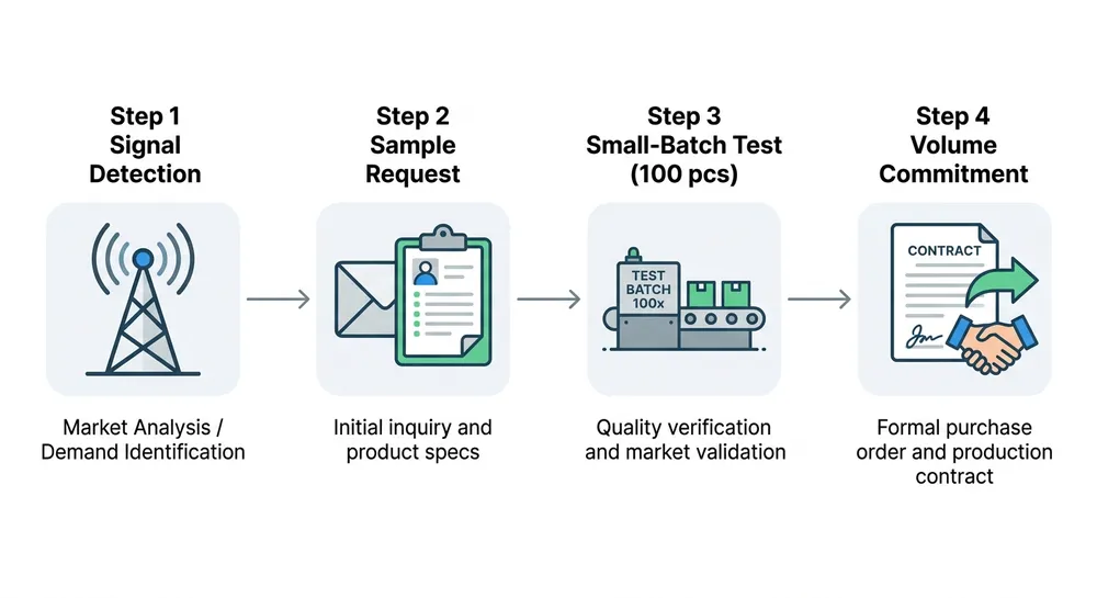
If you're launching a new style-finish combination or entering a new wall art category, don't commit to full volume on the first order.
Our standard MOQ starts at 100 pieces for standard models. That's enough to test a style-finish combination with your actual customers before you lock in thousands. Order 100 pieces of your modern geometric in matte black, 100 of your abstract in antique bronze, and 100 of your nature line in distressed white. Put them in front of your retail buyers or on your e-commerce listings. Confirm the finish reads correctly in your actual sales environment before you commit to a full production run.
(One distributor tested a textured champagne finish on 100 abstract pieces, found it photographed poorly under studio lighting, and switched to a smoother satin version before the main run. That pilot order prevented a much larger problem.)
A pilot run also gives you a physical production sample, not a hand-finished showroom piece, but an actual unit off the line. That's the reference standard your QC should measure against during bulk production. Keep it. Label it. Ship it back to the factory with your next PO if needed.
If you're building out a wall art program across multiple styles and need finish consistency from the first sample through the last container, send your style references and target specs with the substrate, color codes, and gloss ranges outlined above. That gives any factory, including ours, enough information to quote accurately and sample correctly on the first attempt.